
Loveworld
Channel
Imaging

Connecting the world to the Word
We helped Loveworld refresh a channel that hadn’t kept pace with its global reach. They needed a unified system that could translate across languages and cultures, while staying true to the heart of their message.
Setting the Scene

Loveworld is a global Christian broadcast network with massive reach and an even greater mission: connecting the world to the Word. With programming in 15 languages and audiences across continents, they're not merely airing content, they're building a movement.

The Turning Point
Visually, the brand hadn’t evolved at the same pace. After two decades on air, Loveworld’s identity needed a refresh to match its global reach.
They didn’t just want a facelift, they wanted a system:


bold,
unified
& Fresh

Something that could translate across cultures and languages, while still staying true to the message at the core.

The Process
With a fresh new logo and visual identity already in place, we stepped in to bring it to life through motion. Our focus was the channel’s core, the ident, a piece that would set the tone for everything else on air.

Concept
development


Storyboards
We began with concept storyboards to shape a clear, symbolic narrative. From there, we developed style frames that translated the new brand into motion, with layered visuals, abstract forms, and vibrant energy.


Layered, abstract forms


After aligning on the direction, we moved into animation, carefully crafting a sequence that felt both cinematic and spiritually resonant. With the ident locked, we expanded the system into a full broadcast package, including lower thirds, bumpers, lineup boards, and 15 colour variants tailored for the channel’s multilingual reach.


both cinematic and spiritually resonant

The Solution
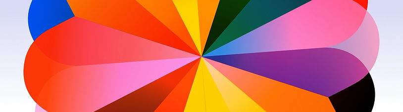
The ident delivers the message without a single word. A glowing sphere representing Jesus moves through darkness, bringing colour, energy, and transformation to every shape it touches. As the abstract forms react and evolve, they come together to form the Loveworld logo, revealing a sense of unity and purpose.


It’s all built around simple shapes and layers of meaning. The logo, made of petal-like pieces, separates and reconnects to show depth. The design stays abstract on purpose, no literal characters or heavy symbolism.
movement, light & transformation


Alongside the ident, we delivered a complete broadcast package: lower thirds, bumpers, lineup boards, and 15 colour variations ready for multilingual rollout.


Style Frames


Break Bumper
Up Next Strap


Daily Lineup


Weekly Lineup
Impact
With the new visuals, Loveworld no longer has to explain who they are, the brand does the talking. The ident doesn’t need to rely on voiceover or translation to get the message across. It shows it. Viewers see light overcoming darkness, individuals connecting into a larger whole, and a global message that’s personal and universal. Now, whether you’re watching in Lagos, Lusaka, or Luanda, Loveworld looks like what it stands for.
